Wednesday, August 20, 2008
Tuesday, July 15, 2008
My Chosen Vanita is...

I chose this Vanita for a number of reasons. The main reason for choosing it was that i though it would be easier to paint because it has less going on. I also had this idea of my objects/symbols being on the desk around the pocket watch creating a "cluttered desk" effect, much like my desk at home. I also think that because it's more simplistic, I think it will be easier to complete on time, providing I put the effort in.
My Chosen Symbols
I have finally chosen the objects that I will include in my Vanita.
My Birth Bracelet: I have decided to use my birth bracelet as one of my symbols for the simple reason that it is very important to me. I have had it since birth and it has great sentimental value to me, so I think that it's use is appropriate. These items are meant to represent us, and the bracelet represent the journey of my life.
My Oval Box: My oval box is a gift that I received some years ago that I use to keep little, special item in. Once again, it means alot to me, so i thought i should use it.
My iPod Headphones: My 3rd and final item that I plan to put in the Vanita is my iPod headphones. I listen to m iPod all the time, so i think that they deserve a spot in my Vanita. I also feel that music is a great and powerful way to express yourself, and is a way in which I express myself. This also prompted my want to include the headphones as they represent the music.
Narrowing Down The Choices
As well as deciding which symbols to include in my Vanitas, I also have to choose which Vanitas I will use.
After much consideration, I have narrowed down my choices to the following two:
 I particularly like this Vanita. I like how it contains many different objects that are all packed together onto the shelves. I think that it would be interesting to place my own items in this painting, and I also feel there are a lot of opportunities to do so. On the other hand, this piece, I think, would be very complicated to paint on the canvas. I think that I would struggle getting the scale and shape of the objects within the image.
  This Vanita I also like. I think that it would be quite easy to insert my objects and symbols into the Vanita as objects on the desk around the pocket watch. I also think that this Vanita would be challenging to paint, but not overly difficult and time consuming to complete. I also think that the scale would be easier to keep.
Appraising Task Practice
Here are my practice Appraising Tasks for my assessment.


This artwork is called “38 Degrees” by Ben Quilty. The piece is oil on canvas, completed in 2006. The piece depicts a baby’s face which has a hard, strong expression that makes it look like it is concentrating. It also gives the idea of a temperamental baby. Around the outline of the baby’s head and smudging out from it is a warm red against the white background. Together the piece evokes an emotion that is hard, strong and bold. To create these emotions the artists utilises some of the elements and principles of visual language. One of the elements that stand’s out when the piece is first viewed is texture. The surface quality of the artwork appears to be rough, like it could actually be felt. This looks to have been achieved by the thick, rough application of the paint causing the raised edges. This texture of raised edges has aided the emotion of the piece by emphasizing the lines of the baby’s face and determining the facial features. Line was another element used. The element of line in the artwork has several different uses. The artist has used line to show the emotion in the baby’s face and show the movement of the face. At the eyebrow and forehead above the right eye the artist has used lots of thick brush strokes showing the frowning of the baby. The direction of the brush strokes work out from a fan in the top right hand of baby’s head where the dark purple is used. This also aids the creation of a focal point because the dark purple strongly contrast with the warm red and the white. The thicknesses of the lines also create a sense of the emotions weight, as is the baby is carrying a heavy emotion. Colour is another strongly used element in the piece. The artist has used warm contrasting colours, including pinks, browns, purples, and reds. These are all harmonious colours but they still create a contrasting effect. The contrast of the pinks and purples of the face and the red in the background create an emphasis that makes the face look like it is being pushed forward in an angry way. Kind of like the baby is coming at you. The tone of the colours incorporates both light and dark. This too emphasizes the focal point. I think that the artist might be trying to express the strong emotions that a baby can feel; tiredness, happiness and moodiness. I think that in this particular piece the artist is expressing the baby as being temperamental. The look on the baby’s face is that of a baby that is sitting there, looking up at you because you won’t do something for it.

This artwork is called “Michael and I are just slipping down to the pub for a minute” by Lin Onus. The piece depicts a dingo on top of a stingray riding a wave in the ocean. In the background the sky is fading red to yellow representing the sunset. Together the piece evokes a calm emotion. The waves are big and look to be crashing but the stance of the dingo and the sunset bring forth the calm and relaxed feeling. To create these emotions and feeling the artist makes use of some of the elements and principles of visual language. The emotion of calm against the crashing wave is created by the use of colour. The background consists of warm reds, oranges and yellows blending and fading from the top of the page to the bottom. These contrasts of the warm colours against the cold blues of the ocean create the relaxed atmosphere. The artist also uses the element of line to create movement in the piece. The waves are made to look as if they are moving from the left of the page to right of the page because of their striping. The waves are painted in lines of dark and light cold blues. The shape of the wave itself also creates the movement as they all curve to the right. The direction the stingray and the dingo also add to this movement, facing the right of the piece. This also works to harmonise and balance the piece as the focal point is in the left. Having them facing the right add to that half, thus creating balance. I think that the meaning behind this piece intended by the artist is the struggle of the indigenous person. The dingo and the stingray have aboriginal markings, and the name of the piece is “Michael and I are just slipping down to the pub for a minute”. This artwork shows the struggle that the indigenous man has to go through to get to the pub; a place of relaxation. The harsh waves that the animals have to ride represent this struggle, with the sunset showing the goal, to get to a comfortable, relaxing place.
Analysing Artwork
Part of our art assessment for Term 2 involved us having to analyse an artwork.
When analysing artworks, we learnt that there is a simple method that we can follow:
D.A.I.J.
Describe: What so you see?
Analyse: Discuss the visual language.
Interpret: What is the message? Justify using evidence from the visual language.
Judge: Is the artist successful in getting their message across?
Me
This Vanitas task requires us to contemplate what objects, animals or symbols represent us. I find this rather hard. At the moment I'm just thinkning material possesions and I am struggling to find anything more than that. Hopefully I will be able to. Here is the list at this current stage:
> candle
> my teddy bear
> my gold baby bracelet
> iPod
> my artist book from last year
> Havianas
this list is to be continued...
> candle
> my teddy bear
> my gold baby bracelet
> iPod
> my artist book from last year
> Havianas
this list is to be continued...
Sunday, June 15, 2008
Vanitas
In the arts, Vanitas, is a stpe of symbolic still life painting commonly done by Northern European painters in Flanders and the Netherlands in the sizteenth and seventeenth centuries.
The term, Vanitas itself refers to the arts, learning and time. The word is latin, meaning "emptiness"
Paintings executed in the Vanitas style are meant as a reminder of the transience of life, the futility of pleasure, and the cartainty of death, encouraging a sombre world view. Common Vanitas symbols include skulls, reminder of death; rotten fruit, representing decay like ageing; bubbles, which symbolise the brevity of life and the suddeness of death; smoke, watches and hourglasses; and musical instruments, symbolizing the ephemeral mature of life.
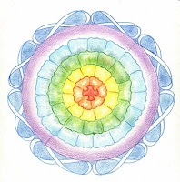
My Serendipity Piece
This is my final Serendipity piece...

This unit, i thin has been about the concept of finding self, and life, and working with the cards you've been dealt. Our art piece for this unit was an ink work which we worked over in pencil creating rhizomes and mandalas, and becoming our very own Andy Goldsworthy. This piece really made me contemplate and reflect upon the ideas that had been presented to us during the unit, as in our final piece we were to create a symbol of self - and that is what the mandalas and rhizomes are all about.
Before we created the final, we originally practised the inks on smaller paper so that we could get somewhat of a handle on the inks. There were multiple ways in which we could apply the inks. For one of them, we immersed the paper in water in a tray, then pulled it out and let the water drain off it. We then dropped the ink onto the wet paper and then let it spread. From there we could just leave it, or we could manipulate the paper to make the ink run in certain directions. We could also add multiple colours of ink. Another technique that we practised was spraying the paper with water and then dropping the ink. We could also spread the ink by blowing it with a straw, instead of moving the paper.
For my final piece, I used a combination of the techniques. I mostly sprayed the paper with water and then added the inks. To move the ink I manipulated the paper, and i used a straw. The one and only thing that i found frustrating about the concept of Serendipity, was the lack of control you had over the outcome.
 These are some close up images of my final piece, courtesy of Mrs Vincent.

Mandalas & Rhizomes
For our final Serendipity piece we have to draw in Mandalas & Rhizomes, working with what the ink has created.


Mandalas...
The word "Mandala" is loosely translated to mean "circle". A mandala is far more than a simple shape. Mandalas represent wholeness, and can be seen as a model for the organizational structure of life itself - a cosmic diagram that reminds us of our relation to the infinite, the world that extends both beyond and within our bodies and minds.
Mandalas appear in all aspects of life: the celestial circles we call earth, the sun, and moon, as well as conceptual circles of friends, family and community.
"The integrated view of the world represented by the Mandala, while long embraced by some Eastern religions, has now begun to emerge in Western religious and secular cultures. Awareness of the Mandala may have the potential of changing how we see ourselves, our planet, and perhaps even life."


Rhizomes...
In philosphy, the term Rhizome has been used as both a metaphor and a concept, and refers to the botanical Rhizome. The botanical Rhizome is the roots of plants that grow underlground in long strands.
Carl Jung used the word "rhizome", also calling i a "myzel", to emphasize the invisible and underground nature of life:
"Life has always seemed to me like a plant that lives on its rhizome. Its true life is invisible, hidden in the rhizome. The part that appears above the ground lasts only a single summer. Then it withers away - an ephemeral apparation. When we think of the unending growth and decay of life and civilisations, we cannot escape the impressions of absolute nullity. Yet I have never lost the sense of something that lives and endures beneath the eternal flux. What we see is blossom, which passes. The rhizome remains."
Serendipity
"Chance"
Definitions: The art of finding something by looking for something else, or making a desirable discovery by chance/accident - "a happy accident"
hWe used the philosophy of Serendipity through using inks.
Although you can manipulate ink, to some extent it is still uncontrollable, therefore you don't have full control over the outcome and have to work with what you have.
Here are some of my practice ink manipulations:

This was my first ink manipulation practice. I found the inks incredibly hard to control. They would run where ever they please, with me having very little say in the outcome. I do like this piece alot though. I like how all of the colours blend well. Up in the top left-hand corner it a blue dark spot that smudes out. This is an aspect I particularly like. I also like the sort-of-rhizomes that have been created in blue at the bottom of the page.
 This was my second practice with the inks. The technique I used involved immersing the paper in water, letting it drain off, and then dropping the different colours of ink at the bottom of the page. I then picked the paper up and let the inks run, creating the rhizomes. I like this ink piece as all of the colours blend, and I also like the fact that the rhizomes connect.
 This is my third ink practice. For this piece i sprayed the paper with water using a spray bottle and then dropped the ink into the applied water. I then spread the ink using a straw. I did this first with the blue and found it hard and not very effective, only creating short rhizomes. I then tried again with the pink and yellow and found it more successful, creating long, continuous rhizomes.

This was my fourth ink practice. To create the look of the inks in the piece I sprayed the paper with water using a spray bottle. I then, slightly tilted the paper, letting the inks run that little bit. I like this piece because the inks didn't run all of the way of the page, and I like the look it created. I also gained further knowledge on how to control the inks, shown by the short rhizomes.
 This is my fifth ink practice. This is probably one of my favourite piece's. I love the effect that the technique I used created. To achieve this I sprayed the paper with water using a spray bottle and then dropped the inks into the water. I then spread the ink in the splattered effect by further spraying the inks with water from the spray bottle. I aslo liked the way that this technique blended the colours together well. I also felt that this technique gave me a tiny bit more control over the outcome.
Baraka
Baraka is a purely cinematic film directed by cinematographer Ron Fricke.
Baraka depicts footage of various landscapes, chruches, ruins,religious ceremonies, and cities thrumming with life. Baraka was filmed using time-lapse photography inorder to capture the great pulse of humanity as it flocks and swarmsn in daily activity.
Baraka searches for a universal cultural perspective: for instance, following a shot of an elaborate tatto on a bathing Japanese mobster with on of Native Australian tribal paint.
The movie was filmed at 152 locations of 24 countries: Argentina, Australia, Brazil, Cambodia, Chine, Ecuador, Egypt, France, Hong Kong, India, Indonesia, Iran, Israel, Italy, Japan, Kenya, Kuwait, Nepal, Poland, Saudi Arabia, Tanzania, Thailand, Turkey, and the United States of America.
 Here are some scenes from the movie...


Baraka depicts footage of various landscapes, chruches, ruins,religious ceremonies, and cities thrumming with life. Baraka was filmed using time-lapse photography inorder to capture the great pulse of humanity as it flocks and swarmsn in daily activity.
Baraka searches for a universal cultural perspective: for instance, following a shot of an elaborate tatto on a bathing Japanese mobster with on of Native Australian tribal paint.
The movie was filmed at 152 locations of 24 countries: Argentina, Australia, Brazil, Cambodia, Chine, Ecuador, Egypt, France, Hong Kong, India, Indonesia, Iran, Israel, Italy, Japan, Kenya, Kuwait, Nepal, Poland, Saudi Arabia, Tanzania, Thailand, Turkey, and the United States of America.


Andy Goldsworthy
"Seeing something that was always there that you never saw before - like seeing through fresh eyes."
Andy Goldsworthy was born Jul 26, 1956. He is a british sculptor, photography, and environmentalist living in Scotland. His art involves the use of natural & found objects to create both temporary and permenamt scultures which draw out the character of their environment. This means that his work is ephemeral: meaning that it doesn't last
 These are some images of a permenant piece of Goldworthy's, the Neuberger Cairn.
Thursday, April 24, 2008
Andy Warhol
Andy Warhol Quotes...
"I never think that people die. They just go to the department stores."
"Isn't life a series of images that change as they repeat themselves."
Andy Warhola (his real name) was born in Pittsburgh, Pennsylvania, USA. As well as being a central figure in the Pop Art movement, Andy also had a few other credits, including:
- commercial illustrator
- painter
- filmmaker
- record producer
- author
- && public figure
Andy Warhol's work can be deemed superficial to some extent, but that can be taken as a reflection of himself. Andy Warhol has been quoted saying, "I am a deeply superficial person." Isn't it said that an artist work is a reflection of themselves, whether it be their emotions, beliefs or personality? If this is ture, then to some extent it can be justified that Andy Warhol's works are superficial.


Subscribe to:
Comments (Atom)
